Stunning art is created by mastering your technique, but most importantly by choosing the right acrylic pouring color combination. Seriously, you've got half the battle won if you know how to choose your colors!
But, if you are like me, with no art background other than some elementary art classes, then you could easily feel overwhelmed when choosing paint colors for your paint pouring projects. And you might have also fallen into the trap of choosing the same colors over and over!
So I made this post to teach you how I choose colors when I a doing a painting and how you can easily do the same. I will teach you the 3 color-hacks that I use to find awesome color palettes!
We will also talk a little bit about color theory... the color wheel, color schemes, and all of that good stuff. I hope that after reading this post you feel empowered and more confident when choosing acrylic pouring color combinations.
Let's get started with the practical stuff (aka the hacks) and then go into color theory principles so you can understand how to make your own color combos.
3 Color Theory Hacks
Technology is your best friend when it comes to choosing a color combo. You have thousands of color palettes available with just the click of a button.
Hack #1: Pick Colors from a Photo
Picking colors from a nature photograph or any other photograph with stunning colors is one of my favorite color-hacks.
For example, whenever I see a picture that has captivating colors, I save it to my computer for future inspiration. Then I use the Canva color palette generator or Coolors.co image picker to detect the colors in the photograph.
In the following pictures you can see that I uploaded a nature scene photograph to Coolors image picker. Once uploaded, it gave me a 5 color palette. This tool allows you to even export the color palette (as a PDF, image, or SVG file) to your computer for future reference.
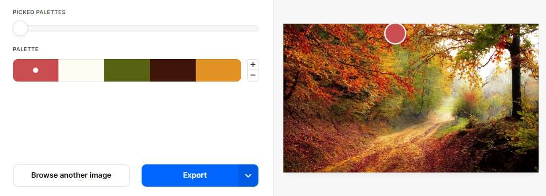

Here is how that same picture's color palette would look like if you used the Canva color palette generator.

As you can see, you might get different color palettes depending on which website you use to detect the photograph's colors. This is normal because scenery photographs have a blend of multiple different colors. Nonetheless, both palettes will still be beautiful!
In my opinion, Coolors.co is better because it allows you to pick a section of the photograph to create your color palette and allows you to expand your color palette choices.
But try both tools to see which one you like the best!
Hack #2: Look at Premade Color Palettes for Inspiration
Did you know that there are already hundreds of color palettes for you to choose from?
There are dozens of sites that have awesome color combinations. Here's a few to get you started:
Trending Palettes from Coolors.co
Coolors.co not only works for creating a color palette from a picture, but it also has trending palettes that you can choose from.
Color Palettes With Photo Samples from Colorpalettes.net
Another site is Colorpalettes.net which gets it's color palettes from pictures. Even though these are not acrylic pouring photographs, you can get a basic idea of how the colors work together by looking at the photograph.
Pre-made Color Combinations on Canva.com
You can even explore color combinations on Canva's color palettes. Choose from the ones shown on the screen or type in a color, theme, or keyword to find a palette that fits your search description.
Color Combinations from Visme.co
Here's a great blog post that has 50 Beautiful Color Combinations for inspiration.
The Paint Department at Hardware Stores
Another place to find color palettes is at the paint department in your Hardware store such as Home Depot or Lowe's.
Paint brands like Behr and Sherwin Williams have plenty of color combos in every shade of color imaginable. These color combos are printed out on cards like the ones shown on the pictures below and can be found on the paint chip wall of the store.


Get a few samples, take them home, and use them to closely match the colors to the colors you have on hand or colors you plan on purchasing. However, with these types of color palettes, you have to be a little careful as some of them have too many colors.
The more colors you mix, the higher the likelihood that you will end up with a muddy looking painting. Even though it is possible to get some beautiful pour paintings by mixing a ton of colors (if you know what you are doing), I recommend that if you are a beginner, you stick with color palettes that have 5 or less colors.
*WARNING- Keep in mind that NOT all of the color palette options and tools mentioned above were created specifically for paint pouring so you will need to adjust the consistency of your paint or layer your colors in a way that will prevent the complimentary colors from mixing too much. Otherwise you will end up with a muddy pour.
To learn more about how to get vibrant colors in fluid art, check out the STOP MAKING MUD course!
Hack #3: Choose Ready-made Color Combos Specific for Acrylic Pouring
If you want color combos that you can download to your phone or computer, or even print out and laminate them for future paint matching and inspiration, then take a look at the options below.
Color Combo Super Mega Pack in PDF Format
If you want a Super Mega Pack of Color Combinations in PDF format, then click here to get 110 color choices for your next painting.
It includes 15 Fail-proof color palettes for beginners, 32 color combos for every season of the year, 15 winter color combos, and 48 color palettes for 8 different colors.
You will need to know a little about color theory for some of these color palettes (except for the Fail-proof color palettes for beginners and the 15 winter color combos) so you know how to layer your colors to get vibrant looking paintings with minimal muddiness.
But this Color Combo Super Mega Pack is a great option for those who just feel overwhelmed when trying to choose a color combination for their next painting.

Color Combos With Actual Paint Pouring Images in PDF Format
These color combos have been tried and tested in actual paint pourings so you can be sure that they will work for you.
They include the color names and hex numbers for each of the colors in the palettes along with pictures of actual paint pourings created with these color palettes.
Here are some elegant metallic color combinations, some captivating color palettes, and luscious bloom color palettes (with 2 recipes) that will surely create some spectacular paintings.


Color Theory for Acrylic Pouring
The biggest mistake that I see people do is choose a palette that was made to be used for interior design purposes and apply it directly onto their canvas without thinking carefully about the layering and consistency of their paint.
Why?
Because, for example, some of the color palettes from the websites referenced above were not made exclusively for acrylic pouring, therefore, they might have a bunch of complimentary colors that look GREAT next to each other but that create yucky muddy looking colors when mixed together if you don't know how to layer the colors appropriately.
This is where color theory for acrylic pouring comes into play. If you know the basics of color theory, you can take any color palette and use it for paint pouring without the fear of creating muddy looking paintings.
The Basics
Let's talk really quickly about the basics of the Color Wheel. There are 2 color wheels that you should be familiar with... the traditional Red-Yellow-Blue color wheel and the less known Cyan-Magenta-Yellow color wheel.
Download your FREE color wheels here to follow along!!!
Both color wheels have three primary colors. The secondary colors are formed by mixing equal amounts of two primary colors sitting next to each other on the color wheel. Tertiary colors are formed by mixing a primary and a secondary color sitting next to each other on the color wheel.
The Cyan-Magenta-Yellow color wheel is the one that I like to use because it creates a wider range of brighter colors. But the principles you will learn next apply equally the same to both color wheels. So feel free to choose the one you feel most comfortable with.
What colors go well together for acrylic pouring?
Now that you know about primary, secondary and tertiary colors, you might be asking yourself "What colors go well together for acrylic pouring?" or "What are the best color combinations?"
Color Categories
Well, to answer these questions, we first need to divide our colors into 3 categories... neutrals, warm colors, and cool colors.
Neutrals
The official definition of a neutral color is a hue that appears to be without color. I like to think of neutral colors as colors that don't compete with other colors and that are calming and relaxing to the eye.
These neutral colors don't typically appear on the color wheel and go well with any color. Since they don't compete with primary and secondary colors, using neutrals is a great way to compliment other colors.
Black, white, and all grays are considered pure neutral colors, while browns, tans, and colors with a low saturation derived from mixing a pure color with a pure neutral are considered near neutrals.
I like to think of near neutral colors as colors that start out as being neutral but have been gracefully add a bit color. Some examples of near neutral colors are blue-gray and ivory.

Other colors such as olive green, navy, sage and burnt orange are technically not considered neutrals but can be used as a neutral since they are calming to the eye.
So for me, I consider neutral colors all shades of black, white, gray, and brown as well as colors that started as neutral but were added a tiny bit of pure color.
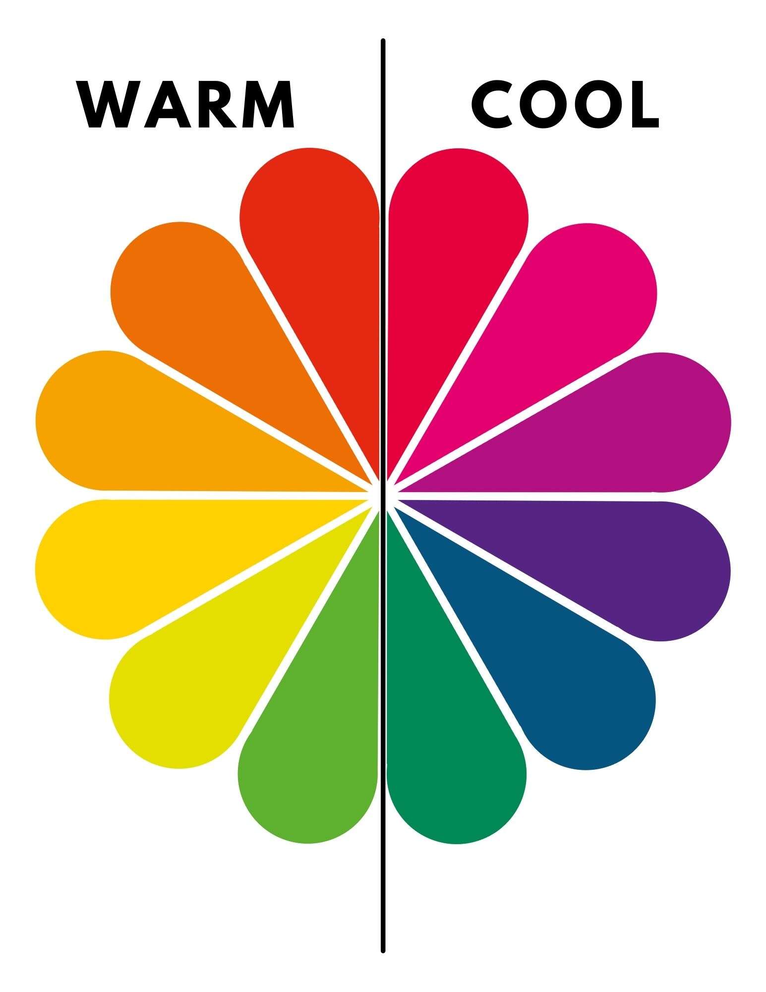
Warm Colors
Warm colors are easier to distinguish. They include reds, oranges, and yellows.
Cool Colors
Cool colors are on the opposite side of warm colors. They include violets, blues, and greens.
Great Color Combinations for Paint Pouring
Now that you know how to categorize your colors, let's talk about how to make great color combinations for paint pouring.
There are many ways of creating great color combinations, but let's just talk about 4 of my favorite ways.
#1. Light and Dark Color Contrast
The best way to make your colors stand out is by combining light and dark colors.
By light colors I mean colors like pastels, light greys, and lighter looking colors like yellow, white, light blue, etc.
By dark colors I mean like dark blue, black, purple, etc.

#2. Neutrals with Bright, Bold, or Metallic Colors
Another way of making great color combinations is by mixing a bright, bold, or metallic color with some neutral colors. The neutrals are calming to the eye and therefore the attention falls on the bright, bold, or metallic color.

#3. Cool and Warm Mix
This type of color combination will make your paintings really pop, however, it also requires that you are super careful when layering the colors.
I recommend that you layer on top of each other the colors that are closer together on the color wheel. Otherwise you will end up with a muddy looking painting because you are mixing colors on opposite sides of the color wheel.

#4. Color Schemes
What are color schemes? Well, they are color combinations that are based on colors at certain locations on the color wheel.
The major color schemes in art are analogous, complementary, split-complementary, triadic, square, rectangular and monochromatic. Choose any of these color schemes whenever you need to quickly choose a palette.
Analogous color schemes use three colors that are adjacent to each other on the color wheel. An example of this could be lime green, yellow, and yellow-orange.

Complementary color schemes use two colors on opposite sides of the color wheel (e.g. yellow and purple). They create a very strong contrast and therefore provide a vibrant feel.

Split Complementary color schemes use a base color and the two colors adjacent to the base's complementary color. This type of color scheme is a little bit safer to use in acrylic pouring than the straight complementary color scheme.

Triadic color schemes use three colors that are evenly spaced around the color wheel. A triadic color scheme can be great when you let one color dominate and use the other two as accent colors.

Square color schemes use four colors that are evenly spaced around the color wheel.

Rectagular color schemes use four colors arranged into two complementary pairs.

Monochromatic color schemes use different values of the same color. They can include all of the tints, tones, and shades of a single color. For example, you could use a dark blue, medium blue, and a baby blue.

Tips for Getting the Best Color Results With Your Color Palette Choice
Here are a few answers for some of the most common questions about pour painting. These tips will help you make the best out of your color palette choice and get awesome pour paintings.
Why is my acrylic pour muddy?
Muddy colors are a result of mixing complementary colors or mixing red, blue, and yellow, therefore, take a close look at your color choices.
However, this does not mean that you can't have complementary colors as part of your color palette. You just have to be extra careful when layering your paints and have to make sure you have the right paint consistency.
Here are some of my tips for avoiding muddy colors. However, if you want to get vibrant colors in your fluid art Every Single Time... then check out my STOP MAKING MUD course!
How to avoid muddy colors?
As mentioned previously, the trick is to make your paint consistency thick enough to have minimal paint mixing or to layer your colors correctly. Separate complementary color layers with a neutral color or a color that is in between the two complementary colors.
How do you layer acrylic pours?
Layer your colors according to the order they are found on the color wheel.
For example, if you want to include Green, Yellow, and Orange in a painting, start with the green, then layer the yellow on top of the green, and then the orange on top of the yellow. You can also layer them in the opposite direction... Orange first, then yellow, and then green.
You can also add a bit of white, black, grey, or any neutral color in between color layers.

If you are a beginner to acrylic pouring and want to learn the basics and techniques of fluid art to create stunning pour paintings, then consider joining my Acrylic Pouring Course!

How to Mix Colors?
When you start choosing your colors combos, you will most likely want to go shopping for a few more colors that you don't have in stock. So let me offer one last tip for you!
Mix Your Own Colors!
Yes, mixing your own colors can save you a lot of money. Once you master this skill, you will be able to custom blend your own colors and shades of paint. Here is a great video that teaches you how to mix your own paint colors!
If this post was helpful, let me know in the comments section below!
For now, Keep Living Life One Pour at a Time!

